

Anaheim has had some of the best caps the majors have ever seen.
They’ve had the best assortment of logos of any team so obviously their hats have been spot on for forever.
From their inception in 1961 to present day, they’ve changed logos, color schemes, and uniforms, and in the process have given us some iconic pieces of headgear in the long run!
Today we’re gonna take a look at every logo and hat the Angels have used since they entered the league almost 60 years ago.
1961-1964


The Angels came into the league with these bad boys back in ‘61. Then just the Los Angeles Angels, they would wear these great caps and use that awesome logos for their first 4 seasons before their move to Anaheim and first logo switch and identity change!
The old fashioned style “LA” and silver embroidered halo onto the top of the hat is a fire combo. The color scheme is just as fire so what’s not to love about these?
1965-1970


To begin the ‘65 season through the ‘70 season, The Angels moved from LA to Anaheim full time meanwhile also becoming the California Angels; which would remain Anaheim’s identity for 31 years.
Keeping with a similar style though to their previous design, they kept the iconic halo embroidered into the top, the same great color scheme, but altered the logo from a classic style “LA” to a classic style “CA” to suit the jump from LA!
Meanwhile, changing their primary logo too they changed the lettering while keeping virtually every aspect of the GREAT logo in tact besides a solid white halo above the letters now rather than an enlarged gold halo as seen in the previous seasons.
This is literally the most difficult Angels hat to find. Original or reproduction of any sort. They’re so rare and loved that if someone gets one it’s virtually impossible they’ll ever let it go!
1971
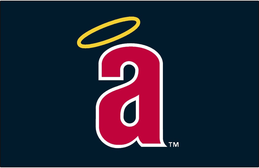
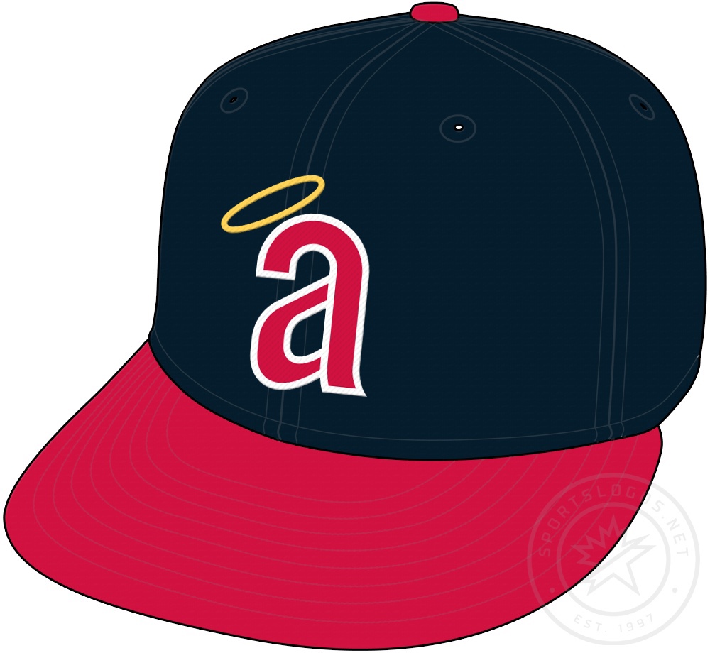
Here comes 1971. Anaheim chose to randomly change up their logo, all the while still, again, keeping virtually all the uniform and hat the same besides that in itself.
This classic Angels cap only lasted 1 lone season, however it made a lasting impression. Changing from the intwined “CA”, they chose to go with a lowercase “a” with the halo hovering above now!
A small idea that would basically lead to almost every angels logo to present day.
1972-1988


This is my second favorite of all the Angels looks over the course of their history. It’s slick, it’s similar to what they’d done up to that point, but it’s a classic logo that honestly they should be using today for both home and away set ups!
So clearly as you can see too, Anaheim had NO idea what the hell they were doing in the 70’s and most of the 80’s. They didn’t know what looked good what was already out of style they just couldn’t decide on one thing for too long for some odd reason.
Besides the fact that they really only waited one season to switch their cap from the lowercase to capital “A”, the switch was perfectly executed.
The new logo here with the pointed narrow “A” with the halo now on the “A” but still above it was SPECTACULAR.
I will say, most wont even notice the minor tweaks on the primary logos they used for almost two decades nearly.
From 1971-1972 they used the state of California with Angels written inside, with the city of Anaheim labeled one a gold star, and the halo hanging on the left corner of the state above where the word mark begins.
So then in 1973 they’re just done with that and the lowercase logo and uniforms, and ride the capitalized “A” word mark Angels logo in the state, all the whole it now say on top halo that rested in its same spot. Now too, they labeled the city of Anaheim in a red star. This primary logo would last up until 1985.
1986-1992

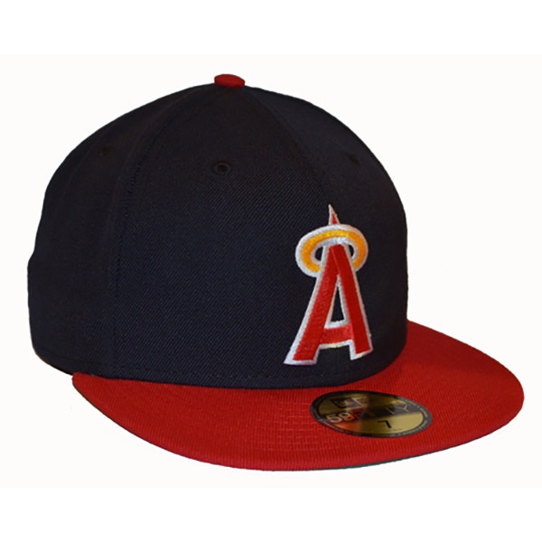

Many people fail to and even then failed to realize that in ‘86 the Angels signature “A” logo got stockier and fatter compared to the far more narrow look everyone had seen for 13 years before.
I personally like both, but I really prefer the skinnier and more narrow logo than this one, however I do prefer this era of their primary logo far far more.
Although the classic state logo is great in itself, the blown up “A” and halo on top of state, in the baseball, with Anaheim still labeled was GENIUS and PERFECT!!
1993-1996


Angels In The Outfield.
That’s what you were thinking right? That’s what everyone thinks when they see this I feel like.
A blast from the past. With a then modern twist. Done to absolute perfection.
In 1993, the Angels decided to again after roughly 20 years later the uniform and logo and color scheme.
Opting to a darker shade of navy blue, all the while keeping the classic red in there too, Anaheim went all out all the while keeping these classic and simple.
These caps featured a more modern take on the 1965-1970 California Angels logo and uniforms. They featured an interlocked “CA” with the halo resting on this logo on the “A” rather than on the crown of the hat.
Mix in the solid blue away cap and the classic blue and red-billed style home hat and this uniform and logo scheme is one of the best they ever tossed in.
What might be the saddest fact of the matter is simply that this just didn’t stick around all that long.
4 seasons is all Angels fans and baseball fans got to see of these and that’s crazy to think seeing how popular these hats were in the 90’s and still are today!
Also, like I said earlier, with the popularity of Angels In The Outfield, it skyrocket the popularity of these hats.
Then, like all things in life, came the big one. The biggest power house in the WORLD if we’re being realistic.
1997-2001


DISNEY.
Disney in 1993 founded The Mighty Ducks of Anaheim, who played basically directly across the street from what’s now known as Angels Stadium.
So naturally, because Disney has to own EVERYTHING at some point or another, they figured why not baseball.
And how perfectly convenient that the Angels were across the street from the other sports team. So in 1997 Disney purchased the Angels and COMPLETELY overhauled the entire uniform and color scheme and logo’s.
These hats and logo’s are my personal favorite. The Disney cartoon style winged “A” is perfect. Throw in the navy blue and periwinkle and minor red touches and it’s the perfect logo and cap in all of sports, let alone baseball!
This too wouldn’t stick around too long unfortunately, and neither would Disney.
The teams tenure with these uniforms and logos was as long as their tenure under Disney ownership. 5 season. 5 short seasons of these beautiful hats.
Oddly enough, in both 2002 and 2007, a year after Disney sold the Ducks and the Angels, respectively, they each again changed their uniforms and color schemes and both those respective seasons following their sale, won championships!
2002-Present


2002 was the glory year for Angels fans. New logos and uniforms, bright red is the new color for the team and in the end they win a World Series.
So with these caps, they decided to go for a solid red piece with a new updated logo. Now it would be a modernized “A” with a silver halo on the top.
This hat and uniform has been the primary Angels set up for almost 20 years now and this is hard to find any complaints about. There’s nearly nothing bad to say about this.
Alternate caps and logos worn and used from 1961-present day.


It would also be the home and away cap from 2000-2001 when they went away with these entirely.


Leave a comment